什么是 CSS
- Cascading Sytlesheets 层叠样式表
- 不是变成语言
- 高速浏览器如何指定样式、布局等
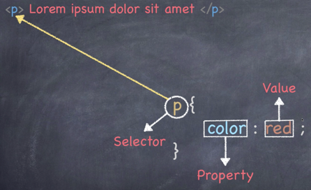
首先介绍一下代码样式,如下图所示:
三种方式添加CSS
- 外部样式表 (最常见)
- CSS 保存在 .css 文件中
- 在 HTML 里使用
<link>引用
- 内部样式表 (较常见)
- 不使用外部 CSS 文件
- 将 CSS 放在 HTML
<style>里
- 内联样式 (不常见)
- 仅影响一个元素
- 在 HTML 元素的
style属性中添加
<!DOCTYPE html>
<html lang="en">

<head>
	<meta charset="UTF-8">
	<meta name="viewport" content="width=device-width, initial-scale=1.0">
	<style>
		h1 {
			color: royalblue;
		}
	</style>
	<title>CSS Crash Course</title>
</head>

<body>
	<h1>Hello World</h1>
	<p>Lorem ipsum dolor sit, amet consectetur adipisicing elit. Voluptates asperiores quod repudiandae in error, et quo
		dolores sunt omnis ratione eum esse alias libero nesciunt deserunt eius qui ipsa quisquam.</p>
</body>
</html>
<!DOCTYPE html>
<html lang="en">

<head>
	<meta charset="UTF-8">
	<meta name="viewport" content="width=device-width, initial-scale=1.0">
	<title>CSS Crash Course</title>
</head>

<body>
	<h1 style="color: red;">Hello World</h1>
	<p>Lorem ipsum dolor sit, amet consectetur adipisicing elit. Voluptates asperiores quod repudiandae in error, et quo
		dolores sunt omnis ratione eum esse alias libero nesciunt deserunt eius qui ipsa quisquam.</p>
</body>

</html>
<!DOCTYPE html>
<html lang="en">

<head>
	<meta charset="UTF-8">
	<meta name="viewport" content="width=device-width, initial-scale=1.0">
	<link rel="stylesheet" href="./css/style.css">
	<title>CSS Crash Course</title>
</head>

<body>
	<h1>Hello World</h1>
	<p>Lorem ipsum dolor sit, amet consectetur adipisicing elit. Voluptates asperiores quod repudiandae in error, et quo
		dolores sunt omnis ratione eum esse alias libero nesciunt deserunt eius qui ipsa quisquam.</p>
</body>

</html>
CSS 的选择器
对于一段 HTML 代码,
<p class="paragraph" id="paral">Lorem</p>
有三种引用方式:
p {
	color:red;
}
.paragraph {
	color:red;
}
#para1 {
	color:red;
}
值得注意的是,对于 class来说一段可以包含多个相同的class,但是 id 必须保证不同。
CSS 里的颜色
- 关键词
- 十六进制
- #ff0000
- RGB
- rgb(244, 0, 0)
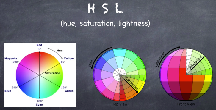
- HSL 色相(hue),饱和度(saturation),亮度(lightness)
- hsl(0, 100%, 50%)
- RGBA 比 RGB 多一个 α 通道
- rgb(255, 0, 0, 0.5)
- HSLA HSL 多一个 α 通道
- hsl(0, 100%, 50%, 0.5)
CSS 中的字体
CSS 的字体见下方:
- 使用
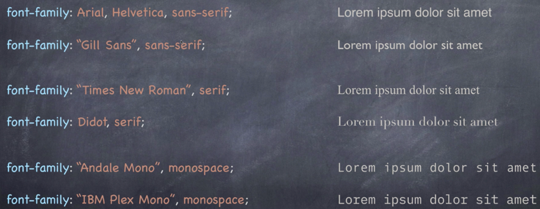
font-family来代表 property。 - sans-serif, 无衬线;serif, 有衬线代表字母的花体
-
Arial, Helvetica,是指前者字体优先,如果Arial找不到,就用Helvetica代替 - 当字体名字中带空格,需要用引号引出,如
"Gil Sans"及"Times New Roman" - monospace 代表等宽
详情见以下网站:
但是,在运用字体时,需要注意电脑的适配性问题,多使用电脑适配率较高的字体。
关于字体排版可以关注, Type is Beautiful。
注意的是,如果定义了 body 的颜色,和 box1 的颜色,但是没有定义 box2 的颜色,这时候 box2 将会默认为 body 的颜色。
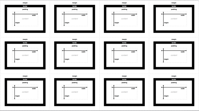
盒子模型(框模型)
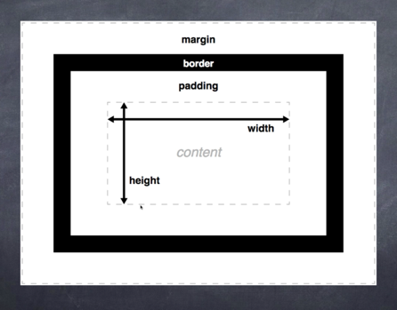
- content ,可以想象为一张图片或者一段文字,注意文字是上下撑顶的
- border ,可以称为边框,一般是没有边框宽度的,可以定义颜色
- padding ,可以理解为内边距,代表内容和边框之间的距离
- margin ,可以称为外边框,表示外边距
如果我们将很多的盒子放在一起,会是什么样子呢?
其实上图中的排列方式是错误的,真正的排列方式如下图:
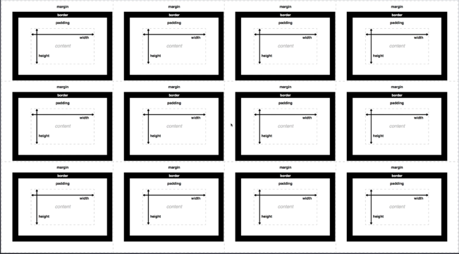
当两个盒子靠在一起,外边距只会取两个盒子间最大的作为自己的外边距,这称为外边距塌陷。
以 margin 为一个实例,
p {
	margin-top : 5px ;
	margin-bottom : 5px ;
	margin-right : 10px ;
	margin-left : 10px ;
}
这样指定能用但是比较麻烦,有三种简单的方式:
<!--方法一-->
p {
	margin : 5px 10px 5px 10px ;
}
<!--指定顺序为顺时方向:上右下昨-->

<!--方法二-->
p {
	margin: 5px 10px ;
}
<!--当上下,左右编剧一样时,可以这样指定,同理全部一样时,指定一个即可-->

<!--方法三-->
p {
	margin : 5px 10px 5px ;
}
<!--左右一致,上下不一致,可以这样指定,顺序为上,左右,下-->
padding 同理。
Position in CSS
- static - 静态定位,默认的
- relative - 相对定位,可以指定left right偏移
- absolute - 绝对定位,也可以做偏移,但是通常情况下雨relative共同使用,参考 relative 定位
- fixed - 固定定位,相对于视窗做定位
- sticky - 根据导航滚动,一定位置后会粘在一个位置上
代码汇总
HTML 代码
<!DOCTYPE html>
<html lang="en">

<head>
	<meta charset="UTF-8">
	<meta name="viewport" content="width=device-width, initial-scale=1.0">
	<link rel="stylesheet" href="./style.css">
	<title>CSS Crash Course</title>
</head>

<body>
	<div class="container">
		<div class="box1">
			<h1>Hello World</h1>
			<p>Lorem ipsum dolor sit, amet consectetur adipisicing elit. Voluptates asperiores quod repudiandae in error, et
				quo dolores sunt omnis ratione eum esse alias libero nesciunt deserunt eius qui ipsa quisquam.</p>
			<button>Button</button>
		</div>
		<div class="box2">
			<h1>Hello World</h1>
			<p>Lorem ipsum dolor sit, amet consectetur adipisicing elit. Voluptates asperiores quod repudiandae in error, et
				quo dolores sunt omnis ratione eum esse alias libero nesciunt deserunt eius qui ipsa quisquam.</p>
			<button>Button</button>
		</div>
		<div class="list">
			<ul>
				<li><a href="#">List 1</a></li>
				<li><a href="#">List 2</a></li>
				<li><a href="#">List 3</a></li>
				<li><a href="#">List 4</a></li>
				<li><a href="#">List 5</a></li>
			</ul>
		</div>
		<div class="block">
			<p>Lorem ipsum dolor sit amet consectetur adipisicing elit. Odio voluptas voluptate eum blanditiis perferendis
				error eveniet ducimus magni ut voluptatum!</p>
		</div>
		<div class="block">
			<p>Lorem ipsum dolor sit amet consectetur adipisicing elit. Odio voluptas voluptate eum blanditiis perferendis
				error eveniet ducimus magni ut voluptatum!</p>
		</div>
		<div class="block">
			<p>Lorem ipsum dolor sit amet consectetur adipisicing elit. Odio voluptas voluptate eum blanditiis perferendis
				error eveniet ducimus magni ut voluptatum!</p>
		</div>
		<!--注意使用float后需要清除-->
		<div class="clearfix"></div>
		<div id="main-block">
			<p>Lorem ipsum dolor sit amet consectetur adipisicing elit. Voluptatibus, consectetur.</p>
		</div>
		<div id="sidebar">
			<p>Lorem ipsum dolor sit amet consectetur adipisicing elit. Voluptatibus, consectetur.</p>
		</div>
		<!--注意使用float后需要清除-->
		<div class="clearfix"></div>

		<ul class="list2">
			<li>List Item</li>
			<li>List Item</li>
			<li>List Item</li>
			<li>List Item</li>
			<li>List Item</li>
			<li>List Item</li>
			<li>List Item</li>
			<li>List Item</li>
			<li>List Item</li>
			<li>List Item</li>
			<li>List Item</li>
			<li>List Item</li>
		</ul>
		<div class="position-box">
			<h1>Heading1</h1>
			<h2>Heading2</h2>
		</div>
		<!--实现按钮或者窗口在边上-->
		<!--将按钮固定在右下角-->
		<button id="fixed">Button</button>
	</div>
	<!--这时调整margin边框位置时,可以使用内联的方式-->
	<div style="margin-top: 1000px;"></div>
</body>

</html>
CSS 代码
body {
	background-color: #f4f4f4;
	color: #555555;
	font-family: Arial, Helvetica, sans-serif;
	font-size: 16px;
	font-weight: normal;

	font: normal 16px Arial, Helvetica, sans-serif;
	line-height: 1.5em;
}

button {
	background-color: #444444;
	color: #fff;
	padding: 10px 15px;
}

/*当鼠标放在button上时*/
button:hover {
	background-color: red;
}

/*按下按钮时*/
button:active {
	background-color: #fff;
}

a {
	text-decoration: none;
	color: #555555;
}

a:hover {
	color: cyan;
}

/*如果访问过如何处理*/
a:visited {
	color: red;
}

.box1 {
	background-color: antiquewhite;
	color: royalblue;
	border: 5px blue solid;
	border-right: 5px red solid;
	border-left: 8px blue solid;
	border-top: 10px green dotted;
	border-bottom: 1px firebrike double;

	border-bottom-width: 8px;
	border-bottom-style: dashed;

	padding-top: 10px;
	padding-bottom: 10px;
	padding-left: 10px;
	padding-right: 10px;
/*整体下移 20px*/
	margin-top: 20px;
}

.clearfix {
	/*去除 left和 right*/
	clear: both;
}

.box1 h1 {
	font-family: 'Times New Roman', Times, serif;
	font-weight: 800;
	font-style: italic;
	text-decoration: underline;
	text-transform:uppercase;
	letter-spacing: 1em;
	word-spacing: 2em;
}

.box2 {
	border: 5px dotted #cccccc;
	border-radius: 35px;
	padding: 20px;
	margin: 20px, 0;

	/*相对定位*/
	/*position: relative;*/
	/*top: 30px;*/
	/*left: 30px;*/
	/*保留原来位置,并发生偏转,不浮动*/

	/*[>绝对定位,在没有上下文 relative 时,是参考当前视窗页面做偏移的<]*/
	/*position: absolute;*/
	/*top: 30px;*/
	/*left: 30px;*/
	/*同时决定平移会使整个盒子浮动起来,不会保留原来位置*/
}

.container {
	width: 80%;
	margin: auto;
}

.box2 {
	text-align: center;
}

.list li {
	/*改变list前的图片标识*/
	/*可以自定义图片*/
	/*list-style-image: url(../image/check.jpg);*/

	/*也可以用自带的*/
	list-style: square;
	background-color: red;
}

.block {
	float: left;
	/*改为三列的形式*/
	width: 33.3%;
	border: 1px solid #ccc;
	/*这时会破坏三列,因为加了边框*/
	/*需要用box-sizing来解决*/
	box-sizing: border-box;
}

#mian-block {
	float: left;
	width: 70%;
	border: 1px solid #ccc;
	box-sizing: border-box;
}

#sidebar {
	float: right;
	width: 30%;
	border: 1px solid #ccc;
	box-sizing: border-box;
}

/*较为高级的选择方式 ---- 伪类*/

.list2 li:nth-child(even) {
	background-color: grey;
}

.list2 li:first-child {
	background-color: red;
}

/*注意不是从0开始计数*/
.list2 li:nth-child(3) {
	color: aqua;
}

.position-box {
	width: 500px;
	height: 500px;
	border: 1px solid black;
	position: relative;
}

/*relative 和 absolute结合*/
/*box 1,2的偏移量是根据 box 说的*/
/*如果将 box的position 去掉relative,则移到页面开头*/
.position-box h1 {
	position: absolute;
	top: 50px;
}

.position-box h2 {
	position: absolute;
	left: 30px;
}

/*固定位置*/
#fixed {
	position: fixed;
	right: 0;
	bottom: 200px;
}
最终网页效果
更多
这里只是谈了很基础的关于 CSS 的介绍。更多内容可以访问mozilla